![[return to the blue blog]](images/blueroom/blue_sheep_box.jpg)

the knitsmithy the blue blog - archives works in progress finished projects free patterns contact: alison [at] knitsmiths [dot] us |
|
june 2, 2008
decisions, decisons While still stymied by the decision over which buttons to put on my babycables cardi, I thought I'd move on to finish up all the little baby sweaters I had in progress. I managed three and then found myself in the same situation again.
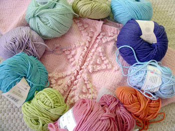
It's time for the embroidery on wee one's bonbon cardigan and a search through my stash came up with too many choices! The original pattern picture shows sweet baby blue, chartreusey green, and orangey pink flower details. I've got those colors. Problem is, I've also got a fun, bright blue, a lighter, grassier green, and a rosier pink that would all look fine too. Plus, there's all the purpley, lavender choices. The original pattern sweater is done in a pale purple, whereas mine is pink so that pretty much leaves all the purples wide open as even more options. Oh, and when I do finish the embroidery, I've still got to pick buttons! posted by alison at 12:21 pm | in
babycables vintage cardi
,
bonbon
Comments
The yarn here matches the quilt square in the previous entry. :D Posted by: ames at June 2, 2008 12:46 PMWhatever you pick it will be pretty. I like the pastel grass green. Posted by: Judy B at June 2, 2008 12:58 PMAre you asking for opinions? 'Cause I've got 'em! :) My faves are the entire bottom section starting from the orange-y color on the lower right across (clockwise) to the purple on the middle left. Posted by: heather t at June 2, 2008 1:05 PMI'm with Heather - I think those are the colors that look the best with the pale pink of the sweater (they also happen to be among my favorite colors). Posted by: Donna at June 2, 2008 1:34 PMAssuming the colors I see are about the same as the ones you see, I like the chartreuse green at the bottom of the button band, the bright sky blue at the top right collar, and the lavender on the left side. Posted by: Suzanne V. (Yarnhog) at June 2, 2008 1:34 PMI like the light purple and the light blue with the pale green. I think the pink would get lost and the bright green and turquoise would drown out any other color you used. Nice work btw. I've been a long time reader. Posted by: SinKnitty at June 2, 2008 2:01 PMI vote the same as Suzanne! I like the brights at the bottom as well but depending on how much you add to the sweater, I would worry about it being 'too much, too bright' Does that make sense? Posted by: Deana at June 2, 2008 2:59 PMI vote the same as Suzanne too! I think the brighter colors would look really nice against the sweater color. Posted by: Minneapolismama at June 2, 2008 3:01 PMI think it's time for a game of eeny meeny miney mo. Posted by: Susan B at June 2, 2008 3:44 PMI favor the light pastels around 9, 10, and 11 o'clock, personally. Posted by: Mary K. in Rockport at June 2, 2008 3:59 PMI would be bad and use all of them. ;) Posted by: Andrea at June 2, 2008 4:01 PMOh Susan, I think you're right!! ;0) Posted by: ALISON at June 2, 2008 5:07 PMI think it would look great with the more muted colors. The pink at least in this photo doesn't look too bright. Of course, I'm wearing muted grey pin stripes and purple today, so I'm probably not qualified to comment. ^_^; Posted by: Seanna Lea at June 2, 2008 5:55 PMI think you have as many opinions here as commenters, but just in case it still isn't enough, here's my two cents. I like the green at 12 o'clock, the baby blue at 3 o' clock and the darker pink at 6. Best of luck narrowing anything down! Posted by: Suzie at June 2, 2008 7:52 PMI agree with Suzie's selections, and I think that the pearl buttons from the last reader-vote would look great on this sweater.. . This would eliminate one set of choices from the charming red sweater button dilemna! Posted by: mary kate at June 2, 2008 10:18 PMAh, clever solution, Mary Kate! Posted by: ALISON at June 2, 2008 10:29 PMAll the colors are so pretty. I understand how hard it must be to make a decision. I would just close my eyes and pick! Posted by: silverarrowknits at June 3, 2008 1:05 AMWhy don't you add a poll feature to your website? I'm partial to blues and purples. Failing everything else you could get the boys to help you. I vote for the pink-green-blue-purple that go from 6:00 to 9:00. I think the slightly brighter colors really keep things perky. Posted by: Sarah-Hope at June 4, 2008 4:55 PM |
