![[return to the blue blog]](images/blueroom/blue_sheep_box.jpg)

the knitsmithy the blue blog - archives works in progress finished projects free patterns contact: alison [at] knitsmiths [dot] us |
|
june 16, 2008
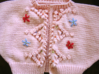
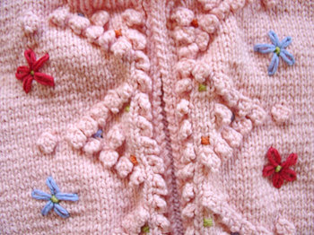
color me bad Wee one's bonbon sweater (who even remembers that one - it was so long ago!) has been patiently waiting for its embroidery. I thought I had so many color choices to pick from in my stash, but I think what was keeping me from just doing it was that I wasn't completely happy with my red/pink options. I finally just pulled three colors I liked from the bag, sat down at Knitsmiths and did the darned embroidery.
Loooooove those flowers!! It's the colors I'm still not sure about. I liked the red a lot (it's actually a sort of coral red, but it turns really red against this pink). While at Knitsmiths, I had also used the coral color in the cross stitches in the triangles. But by the time I got home, I decided it was really too bold there, overpowering the triangles and the other little touches of color in there. I took it out and tried the other pinky color I had (see the link above for the picture), but it was way too pale and was barely visible on the sweater. So I ended up putting some of the orange in there instead. It's better. It's more the right sort of shade (warm, but not taking over). But, still, I didn't love it enough to redo the red flowers.
Take a closer look and tell me what you think. I'm beginning to think that the sweater really needs a cooler color altogether. Maybe orange out, red out, and the lilac in? posted by alison at 9:52 am | in
bonbon
Comments
The orange, green, and lilac touches are my favorite. It's beautiful. Posted by: Jennifer at June 16, 2008 10:01 AMI'm with Jennifer. The red is just the wrong shade, I think and the lilac would be great against the pink. Posted by: Debby at June 16, 2008 10:07 AMI agree with both Jennifer and Debby. As much as I like red as a color, orange, green, lilac seem to work better for this cardigan. The cardigan itself is beautiful. Nice work. Posted by: knitterlee at June 16, 2008 10:11 AMred out and lilac and green in with a small touch of a slight yellow Posted by: Celaine at June 16, 2008 10:13 AMDefinitely lilac. I like the green too. Such a cute sweater. Wee One will be darling in it! Posted by: Katherine at June 16, 2008 10:25 AMI think the contrast of have slightly different colours in the flowers and in the triangels is charming. I also think a lilac and green combo would be really nice. Though it might still be nice if you kept the blue. The red is too strong of a color for the pink sweater. Posted by: C at June 16, 2008 11:54 AMI love the colors you've chosen for the little dots. If you're going to take out a color, the red could probably go. Replace it with one of the dot colors. Do you really have to have the flowers? It seems that the bobbles and dots should be enough. Posted by: Penny at June 16, 2008 11:57 AMUniversal agreement . . . the orange green and lilac are the winners! Definitely! Posted by: mary kate at June 16, 2008 12:20 PMI think it looks cute the way it is! Posted by: Melissa at June 16, 2008 12:57 PMI too think lilac would be better than the red - it pops out too much. Posted by: Amy at June 16, 2008 1:12 PMFor once I don't like the colours (I usually love what you make). I vote for green and lilac instead of the red and blue... Posted by: Kristin at June 16, 2008 2:29 PMI like the red, but agree that it is overpowering the other colors. If you want to do flowers in different colors like that, choose ones that won't compete. If you like the red, make all the flowers red and choose a green accent that has a little more oomph :) Posted by: Lyssa at June 16, 2008 2:29 PMDifferent opinion altogether - I think the detail with the bobbles is great without any embroidery. I tend to like embroidery on very plain designs. Posted by: homejewel at June 16, 2008 6:40 PMred out, lilac in. Posted by: Lori at June 16, 2008 7:26 PMI would change the red for yellow or lilac. Posted by: Charlotte at June 16, 2008 7:40 PMI think the blue throws it off. I would remove it and try the lilac. It's very beautiful and those finishing touches can really make or break an entire project. Posted by: Elaine at June 17, 2008 6:45 AMThank you so much everyone for your thoughts! It's good to hear that I'm not just over-thinking this one - there really is something not quite right about those colors together. I'm going to give the lilac a try first and see how it looks.... Posted by: ALISON at June 17, 2008 9:36 AMi love the colors. the only one i was iffy on was the yellow, but i like the pink and the red together. kudos! Posted by: nicole at June 17, 2008 10:17 AMHm. All I see when I look at the sweater is red flowers. Posted by: ames at June 17, 2008 10:25 AMIt really is beautiful! I think the red is a bit strong, but I'd want to see it in person... Can you bring it tomorrow night?! I think a soft green in there might be pretty, or the lilac, or both! Posted by: Dani at June 17, 2008 1:26 PMI am going to go with Charlotte on this one. I think the blue is perfect and I would use yellow where the red is. :) But I have to say I think it is cute the way it is.. reminds me of something from the past. :) Posted by: Toni at June 17, 2008 1:54 PM |