![[return to the blue blog]](images/blueroom/blue_sheep_box.jpg)

the knitsmithy the blue blog - archives works in progress finished projects free patterns contact: alison [at] knitsmiths [dot] us |
|
january 26, 2009
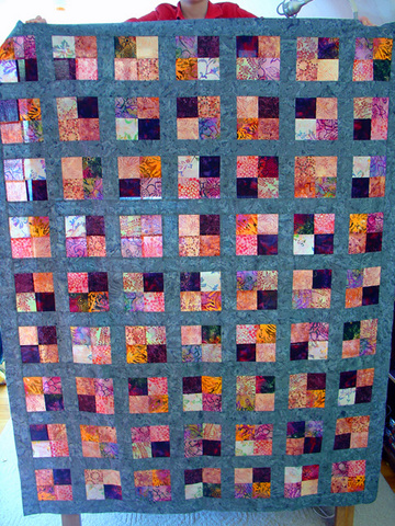
purple pop quilt top
Alright purple people, what do you think about the background color?! I tried out so many different fabrics for the sashing and borders on this! Every one I chose ended up taking over - it was a pink quilt with purple blocks or an orange quilt with purple blocks, or, surprisingly, even worse, a really purple quilt with purple blocks! Then finally, a full five minutes after the store was supposed to have closed, we tried this teal-blue-gray fabric. It was stunning! The purple blocks suddently started to sparkle like gems in this rich bluish sea. Arranging the blocks took a while. I tried to keep the same fabric from meeting itself either vertically or diagonally. Luckily, I used batiks so even in the few spots where they do meet, they don't match. Of course, there are many spots where different fabrics meet and do seem to match but when you look closer, you see that they have different prints or patterns. I took the most time arranging the little splashes of orange and the pale lilac (almost white) patches so that they would move your eye across the quilt. I liked the orange so much I even put it in each of the four corners and also placed it in the very center. And I just love how the dark purple patches stand out and form their own sort of pattern, dancing around the in the quilt. I have to say that although none of this is exactly my color or my taste in fabrics, I'm quite pleased with how it's come out. I found a wonderful coordinating print for the backing, which is awaiting piecing right now. Tonight I pin and then it's time to start quilting! posted by alison at 11:43 am | in
caring quilts
Comments
This is beautiful! I agree that the muted background really highlights the beautiful bits of lavender-purple and gold. These are going to be some very happy, lucky recipients! Posted by: Pea at January 26, 2009 11:59 AMLovely, lovely, lovely. I MUST try sashing. In fact I'm going to go right home now and try it. Posted by: Liz T. at January 26, 2009 12:05 PMWow... that looks great! Beautiful... the orange really makes it pop. Posted by: Manda at January 26, 2009 12:19 PMIt definitely works Posted by: Sarah at January 26, 2009 12:39 PMWOW!!! Posted by: Leslie at January 26, 2009 12:46 PMGorgeous. Works SO WELL!!! Posted by: Cynthia at January 26, 2009 12:50 PMSorry, I don`t like it too much, might be the colour accuracy on my mabook, but it doesn't touch me. To me it looks like real blue in the backround. Liebe Grüße Sibylle Posted by: Sibylle at January 26, 2009 12:58 PMThis is a great lesson in colourwork. The theoretical discussion leaves me a bit dry, but this is real life choices in action. Quilting may not be difficult, but this creating is really hard work. Posted by: Angie at January 26, 2009 1:06 PMI really like the way this came out! I probably would have gone with a purple shade... and then been unhappy with it without knowing why. You did great! Posted by: Pam at January 26, 2009 1:17 PMI am not even a purple person, and I would be ABSOLUTELY THRILLED to have this quilt decorating my bed. It looks fantastic!! Posted by: Sarah at January 26, 2009 1:19 PMPerfect Posted by: Cara at January 26, 2009 1:23 PMAfter trying to make a mitered-square afghan with primarily purple & complementary colors, I can empathize about the difficulties of purple! It was the color of the college she was attending, so I was stuck...but it was tough! Your quilt top looks amazing! Posted by: Laura at January 26, 2009 2:04 PMSorry to hear that it doesn't speak to you Sybille. It is much nicer in person. I wish I had a spot in the house where I had good lighting and enough room to lay it out. I'd take it outside for the photo, but there's two feet of snow everywhere, so that's no good either. ;0) And sashing is the name for all the strips around and between the blocks that separate and frame them. Don't know what it is in German, but it's the same word we use for the framework in a window, holding the separate panes together. Posted by: ALISON at January 26, 2009 2:07 PMthis turned out great.... i am surprised at the color combination but it looks wonderful i bet it even looks better in the full sunlight. Posted by: bettina at January 26, 2009 2:21 PMYes, Laura, purple is tricky! I hadn't realized how hard it would be to find a good color to set the blocks. I never would have guessed that I'd end up with a blue and even now when I think of it, it seems odd, but when I see it all spread out, I think it's ended up lovely. I so wanted to find another purple, but every time I tried one, uuuggggh, it was soooo purple it was like a joke! I can't imagine how hard primary purple must have been. Too much of that and it's got to be like Barney or something! ;0) Posted by: ALISON at January 26, 2009 2:26 PMIt is gorgeous! Not being much of a purple person, but knowing several, it turned out great. If you ever make another purple quilt, a nice green might work, but then teal is a blue-green. At any rate, great job! Posted by: Katie Jo at January 26, 2009 2:31 PMA real winner! Be sure to take lots of pictures -- maybe a framed, good-sized picture should hang somewhere in your house. It's art, after all. Posted by: Luise at January 26, 2009 3:01 PMI really like the almost stained glass quality of the fabrics. It's not really reading purple on my macbook either, I'm getting a lot of pink/golden yellow. It is truly lovely though. Posted by: Jenna S at January 26, 2009 3:02 PMI think it's stunning! :) Posted by: sew funky at January 26, 2009 3:41 PMThat looks so awesome! And I really like the placement of the orange squares as well. Posted by: Chancy at January 26, 2009 3:43 PMGreat job! Funny thing, though. That teal in the picture doesn't look like teal at all. It looks like... purple. It works really well. Posted by: Shanon at January 26, 2009 4:31 PMToo funny, Shanon: "it looks like... purple". Love it! This blue is a weird animal, it's one of those colors that won't quite settle down and just be one color. I think that helps it recede a little into the background and keep the quilt from become just a blue quilt with purpley blocks. Posted by: ALISON at January 26, 2009 4:34 PMYou're right Alison. There is such a think as too much purple (unlike red, of course, of which there is never enough - tee hee.) Your greyish-blue background lets the purple be the star. I'd love to see it in person. Posted by: Libby at January 26, 2009 5:32 PMI agree with Shannon - it looks like a lovely grayed purple (which I like better than garish bright purples anyway). Love it. Posted by: Donna at January 26, 2009 5:48 PMI think it's beautiful! Posted by: Melissa at January 26, 2009 6:47 PMLove it! The colors just pop. Posted by: Suzanne at January 26, 2009 6:54 PMBeautiful Alison. I've been wearing the hat and get compliments on it. Thanks again! Posted by: Eileen at January 26, 2009 8:13 PMThat is absolutely GORGEOUS, Alison - and I'm a purple person! It is funny how putting that finish touch, be it border or sashing, can not only make/break the quilt, but surprise you too! I have replaced a border fabric purchased with the original fabrics, because at that point, it wasn't right any longer. I'm sure your recipients will be delighted. Posted by: Robby at January 26, 2009 8:41 PMI really like it! I love how the dark square in the four-patch sings. (full disclosure: I am a purple person. But blue purple, not red purple.) I suspect that like red, purple is hard to photograph. Posted by: Cathy at January 26, 2009 9:13 PMI have to agree with Sibylle - not purple enough. And there is never such a thing as too much purple! I should mention that I've loved purple hard since the age of 2, which might explain my extreme views. Posted by: Susan at January 26, 2009 9:51 PMWell THIS purple person loves it. It looks beautiful. And the batiks are a good call. Keeps the purples looking lush and exotic and not so..."purple." Posted by: Laurie at January 26, 2009 10:15 PMBeautiful. If for some reason they're not head over heels for this, send it my way. Just lovely. I'm not even a "purple" person. Posted by: Katie J at January 26, 2009 11:11 PMI like it but I was wondering if you had tried a green, as I could see that working. Posted by: Melina at January 27, 2009 1:09 AMWOW. I told you that I'm a purple person and don't like the fabrics... but I LOVE THE QUILT. It's incredible. It's really, really beautiful. And you are a genius, for seeing that potential. Although maybe it's more of a comment on me than on you. So - I take it back. It's fantastic. Sorry for doubting you. Posted by: Rina at January 27, 2009 5:58 AMSo pretty! Posted by: Jane at January 27, 2009 8:29 AMThat came out really nicely and boy is it huge! If I had been looking for a color, I would have probably picked out a dove grey or greyish lilac color. They probably wouldn't have worked as well as the tealish blue! Posted by: Seanna Lea at January 27, 2009 2:28 PMdancing and sparkling are just the right words to describe how those splashes of pale and dark and bright colors look. Lovely. Posted by: Meg at January 27, 2009 2:35 PMIt does look good and the details of the fabrics! Posted by: Amy at January 27, 2009 5:07 PMI think it's BEAUTIFUL!!! My favorite color is pink. To me, purple is an extension or included in the pink family. I agree with others who said your quilt is a true lesson in color theory. Posted by: Sherry at January 27, 2009 5:53 PMAwesome! Posted by: Emily at January 27, 2009 9:49 PMWait a minute. It seems like just yesterday you were asking our opinions about colors... and you're already showing us a gorgeous finished quilt? Wow! You're amazing. The quilt is stunning. I love the pattern and the colors. Posted by: Jennifer at January 28, 2009 6:35 AMToo funny, I've heard that different computers can show colors differently, and from reading the other comments, I guess it's true. I see teal on my screeen. Man, it must be a bear to buy yarn online if you have a Mac! Marvelous! Great job! Posted by: Brandi at January 31, 2009 9:37 AM |